In this article, I want to show you how you can create dashboards in Google Analytics that only display data from users that are visiting a specific set of pages. This is especially useful if you only want to consult the performance of a specific content silo within your website without having to play with dimensions every time you look at another section of Google Analytics.
This is a very simple process in essence but it does require a bit of time investment upfront. So without further ado, let’s get into it.
For the purpose of this tutorial, I will show you how I created one custom dashboard in Google Analytics that focuses specifically on the users of my website that are visiting the various content silos of my website. The goal of this tutorial is to eventually have a custom report where I can see the overall performance of my Python silo of articles, my Google Sheets silo and my Mautic silo as well as the most visited pages of each section and which silo is turning the most users into email subscribers
Create a Custom Dashboard in Google Analytics
The first part of this whole process is going to be about creating a custom dashboard. A custom dashboard in Google Analytics (Which from now on is going to be referred as GA) is a set of widgets that filters the data from your GA instance based on a set of filters and only display the metrics that you picked.
To create a Custom Dashboard in GA, head over the “Customisation” section of your interface and in “Custom Dashboards”.
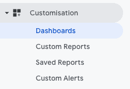
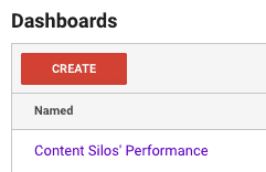
This section of GA will display a list of all of the Custom Dashboards you have already created.
To create a new one, simply click on the red “Create” button.
Once you have clicked on this button, you will be greeted by this interface.
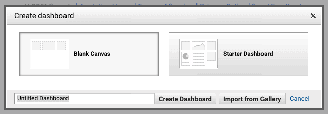
The first thing we want to do here is name our report. I usually name my custom reports based on the main goal I want my dashboard to track. In this case, I called my report “Content Silos’ Performance” as it’s going to be a dashboard that is going to give me an overview of the performance of my different silos of content at a glance.
Once you have picked a name for your dashboard, make sure you have selected “Blank Canvas” and click on “Create Dashboard”.
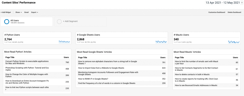
For now, let’s focus on creating our first metric overview for my Python silo. The first thing I want to see when opening this report is the amount of page views all of my Python articles have generated and have a list of something like the top 10 pages.
To create our first widget, we’ll simply click on the “+ Add Widget” button located at the top-left corner of the Dashboard’s screen. Here, we are greeted by this window:
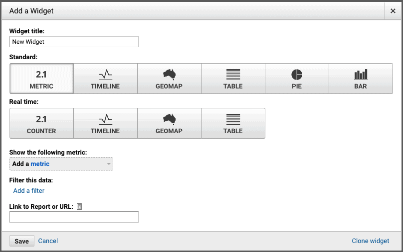
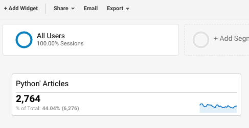
For starters, we will name our widget. In my case, I want this widget to give me a simple number for the amount of users my Python articles have seen during a specified date range. To do so, I filled my widget like so:
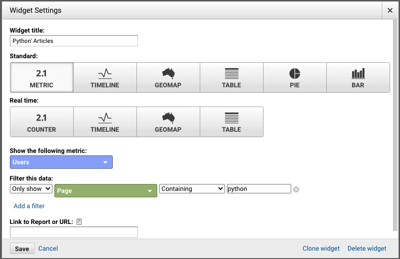
Really simple. And here is how it looks in our dashboard:
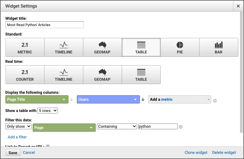
Now, i want to display a list of the top 5 articles from my Python posts. To do so, I add another widget and choose “Table” instead of the “Metric” display and fill the rest of the widget according tot he data points I want.
And this is the result:
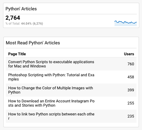
How neat is that?
Now, you may have noticed a “Clone widget” at the bottom-right corner of the widget creation window. This will allow me to easily recreate these two widgets for the Mautic articles and for the Google Sheets’ articles. I won’t bore you with the screenshots and will instead only show you the result of this whole cloning process:
This kind of report allows you to easily compare the progression of your content silos’ traffic month over month. Here is an example of how it would look like.
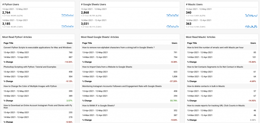
Having these kind of reports for different silos allow you to easily see which silos are performing well and which might need a bit of help/more focus.
Now, we are going to create some more widgets to display some new data points related to the performance of my articles. As previously mentioned, we want to also be able to see which silos are turning the most users into email subscribers. By the way, if you are interested in these kind of guides and in Marketing Technology in general, I highly encourage you to sign up to our newsletter! It’s weekly and is followed by hundred of Marketers already! There is a signup form at the top of your screen :).
Here is how I set my widget to display how many email subscribers one silo has generated over a specified date range.
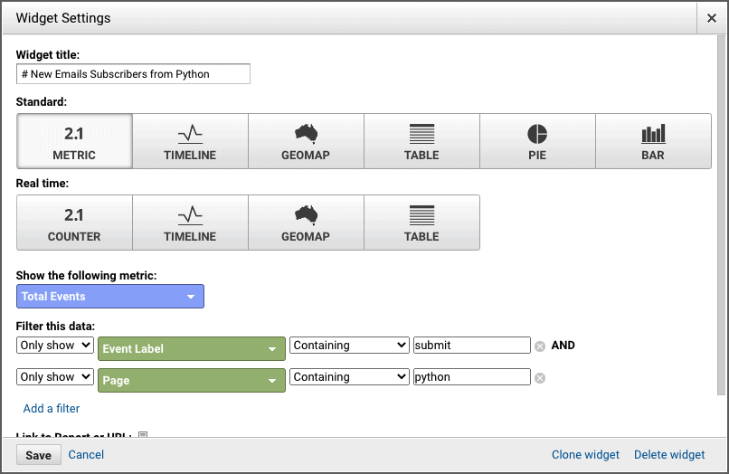
As you can see, I am filtering the data by the “Event Label” containing the word “submit”. In my GA/GTM setup, I have it set that when a user clicks on a “Submit” button, the event is relayed and named “submit-x”. therefore, the filter “Event Label” containing “submit” will collect every kind of submission on my website.
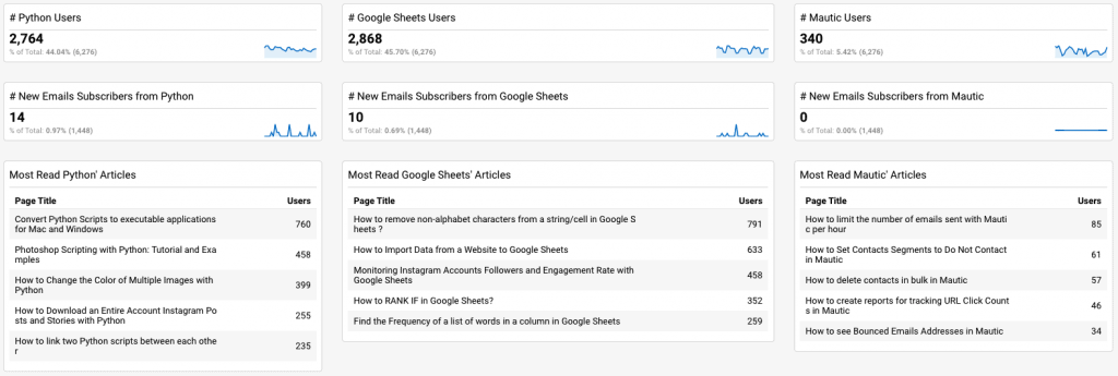
A few widgets cloning later, and this is how my dashboard looks like now:
Conclusion
There are so many more things you can add to your dashboard and the possibilities are truly limitless. But for now, I hope to have been able to answer your main question, which was how to create a report that drills down on specific pages, and to have enlarged your skillset to be able to report in a more efficient ways on the key metrics you are following within your website.
If you are interested in hiring me to create this kind of dashboards, or more elaborate ones, feel free to reach out to me through my “Consulting” page so we can talk about your project.
If you have any questions about this specific guide or would like to suggest a new section, feel free to drop me an email or leave a comment in the section down below.
Thank you for your time!


28 Responses
Thank you for this post. It’s amazing how these plugins provide accessible and easy to understand analytics data. I really need one of these for my website because it’s really hard to interpret data on Google analytics. ..
Hi, It’s a great post. I just came across your blog post and must say that it’s a great piece of information that you have shared. Thanks for the idea.
Hi Yaniss,
I love the way you presented the article,and very impressive thought to put all the learnings into content.Thank you for making us also to learn all the stuff which you are learning.I’m very new to this industry,would you like to write anything about landing pages ,so that I could able to create landing pages by myself?The way of presentation of your article is very clear and easy to do it practically.without wandering anywhere for practical tutorial.I’ll be waiting for your content related Landing pages.
Thank you for this. Exactly what I needed.
Question. How did you setup the progression report. I can’t seem figure out how to setup the date compare.
zujcsl
xrj12q
79zata
9bf54h
k6gfya
9zemay
zpiblu
9yqhrc
ejlx2m
74igh0
0a317y
9ael42
ffiesp
uyiz72
7zf4ym
sjp35p
ccs66l
it72g6
8vw6dp
pk1phh
g728je
61104y
r94v5x
ywhdrh